Van Spaendonck supports and empowers entrepreneurs with a wide range of services. These include HR, payroll processing, legal and regulatory compliance, and business operations. They operate under the Van Spaendonck brand, as well as under the names Wissenraet, MKB Servicedesk and Loket. A clear and well-structured brand architecture. That wasn’t always the case. A fragmented brand architecture and somewhat dated positioning and branding called for a strategically underpinned refresh.
Van Spaendonck sought to strengthen the group through a distinctive positioning and a clear brand architecture for the underlying labels. The aim was to increase brand awareness among SME entrepreneurs, create internal cohesion, and encourage cross-pollination between labels such as Loket.nl, Wissenraet and MKB Servicedesk.
At the same time, Loket.nl approached ZUID with a request for a new logo. The existing strategic foundation seemed sound enough for this. But it soon became apparent that there was confusion in the market regarding the interrelationships and cohesion between the brands Loket.nl, CoPilot and Clever. When companies innovate and launch new products or services, we often see multiple brands emerge. At first glance, a perfectly logical choice. But as you continue to grow, you run into barriers. Van Spaendonck experienced this too.
The projects for Van Spaendonck and Loket.nl ran concurrently, which called for a clear phased approach. Both brands needed to be given a clear positioning and branding within the same framework. We therefore began by redefining the brand architecture and positioning through sessions with the core team and client interviews.
We employed an iterative process consisting of a research phase, with joint sessions, customer interviews and surveys, refining the brand strategy and developing a brand hierarchy matrix. In this, we recommended a hybrid ‘Sub-brand/Endorsed’ model to leverage both the strength of the group and the distinctiveness of the labels.
At the same time, we worked with team members from Loket.nl, Clever and Copilot to determine how we would launch the new, joint Loket brand. The challenge was to create a brand that demonstrates how Loket, with its HR and payroll solutions, effectively supports both SME entrepreneurs and accountancy firms. It was jointly decided to bring all labels under the Loket umbrella and to shift the primary focus to SME entrepreneurs.
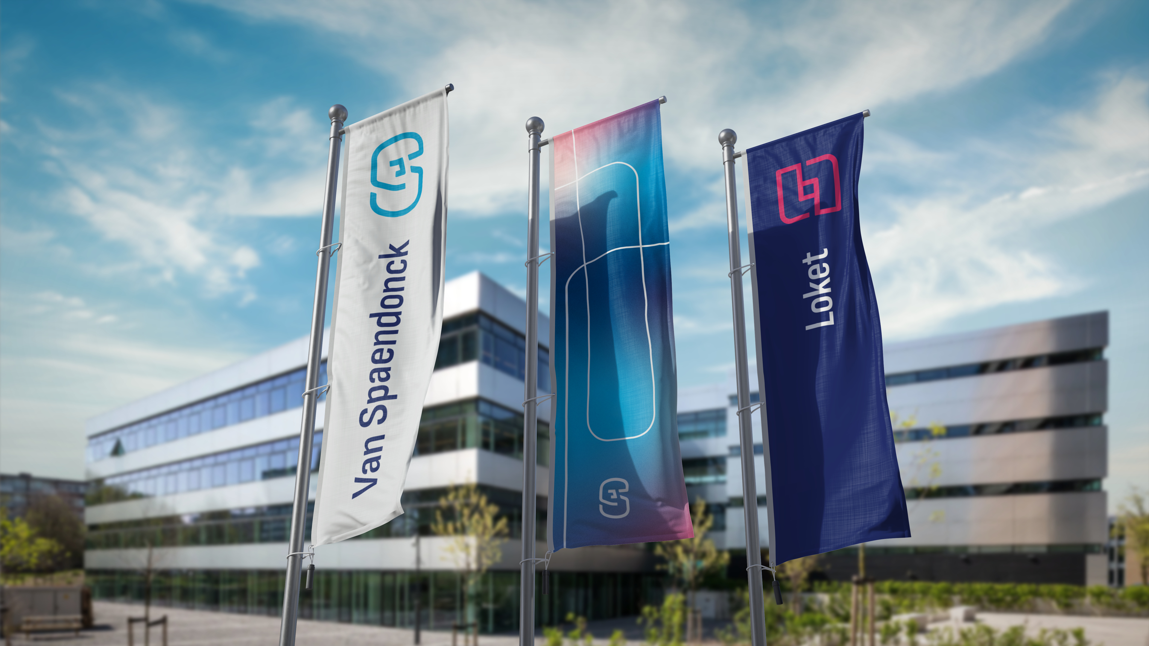
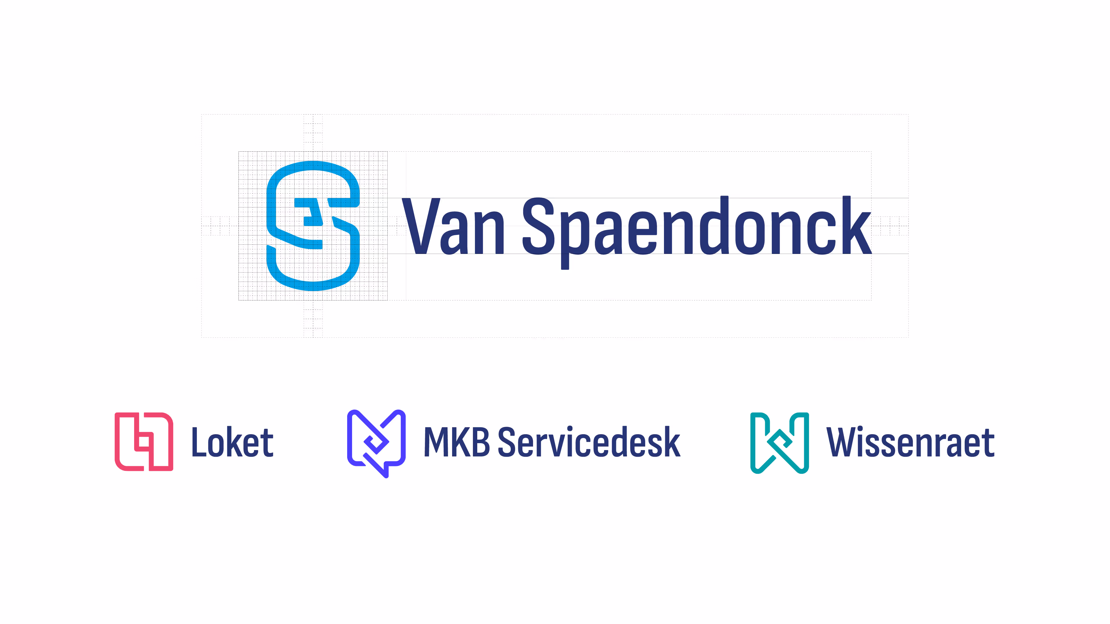
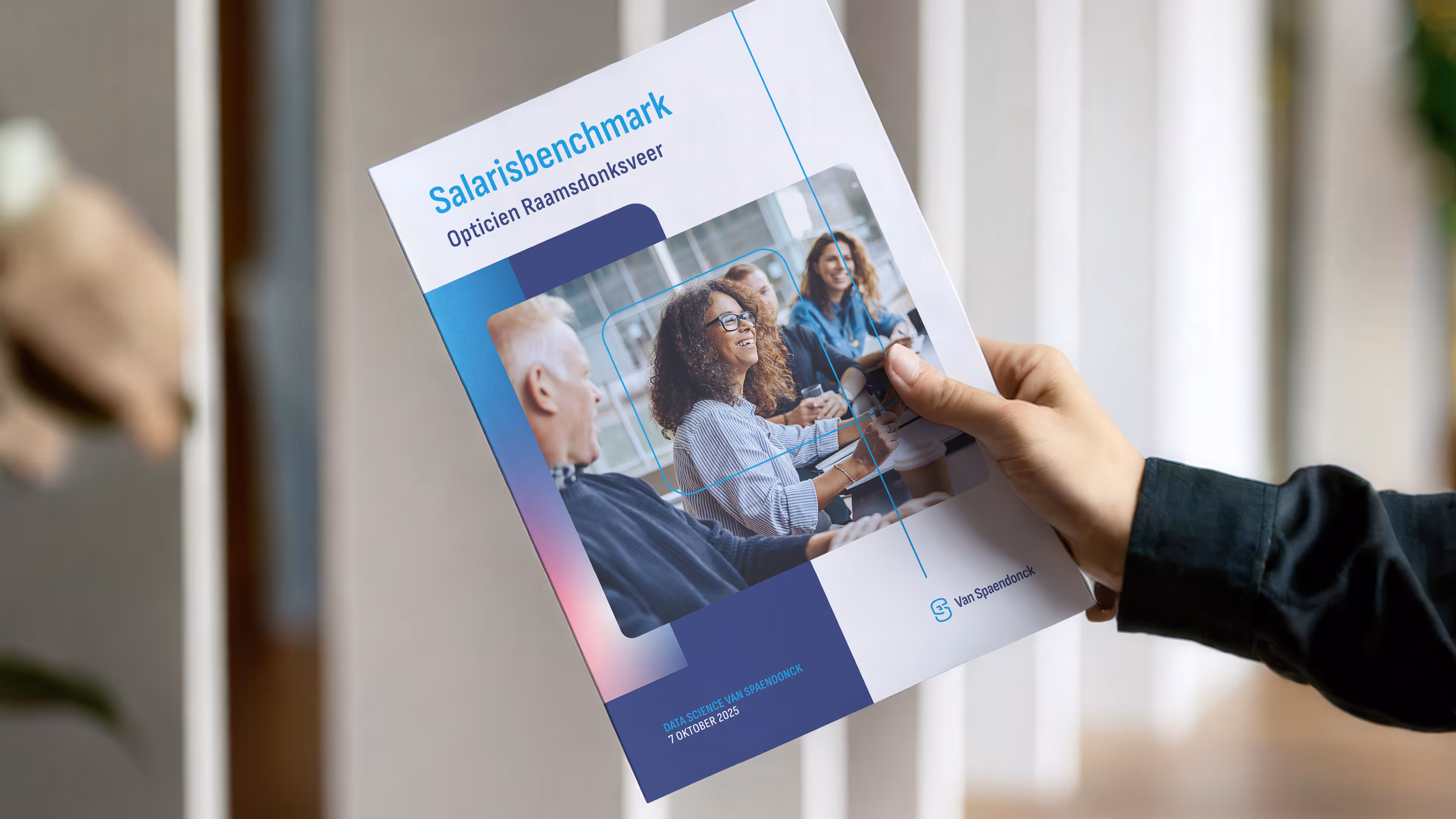
In the phase that followed, we focused on the visual translation of the new positioning of Van Spaendonck, Loket, MKB Servicedesk and Wissenraet. A look and feel that feels like a family, yet also honours the individuality of the brands.


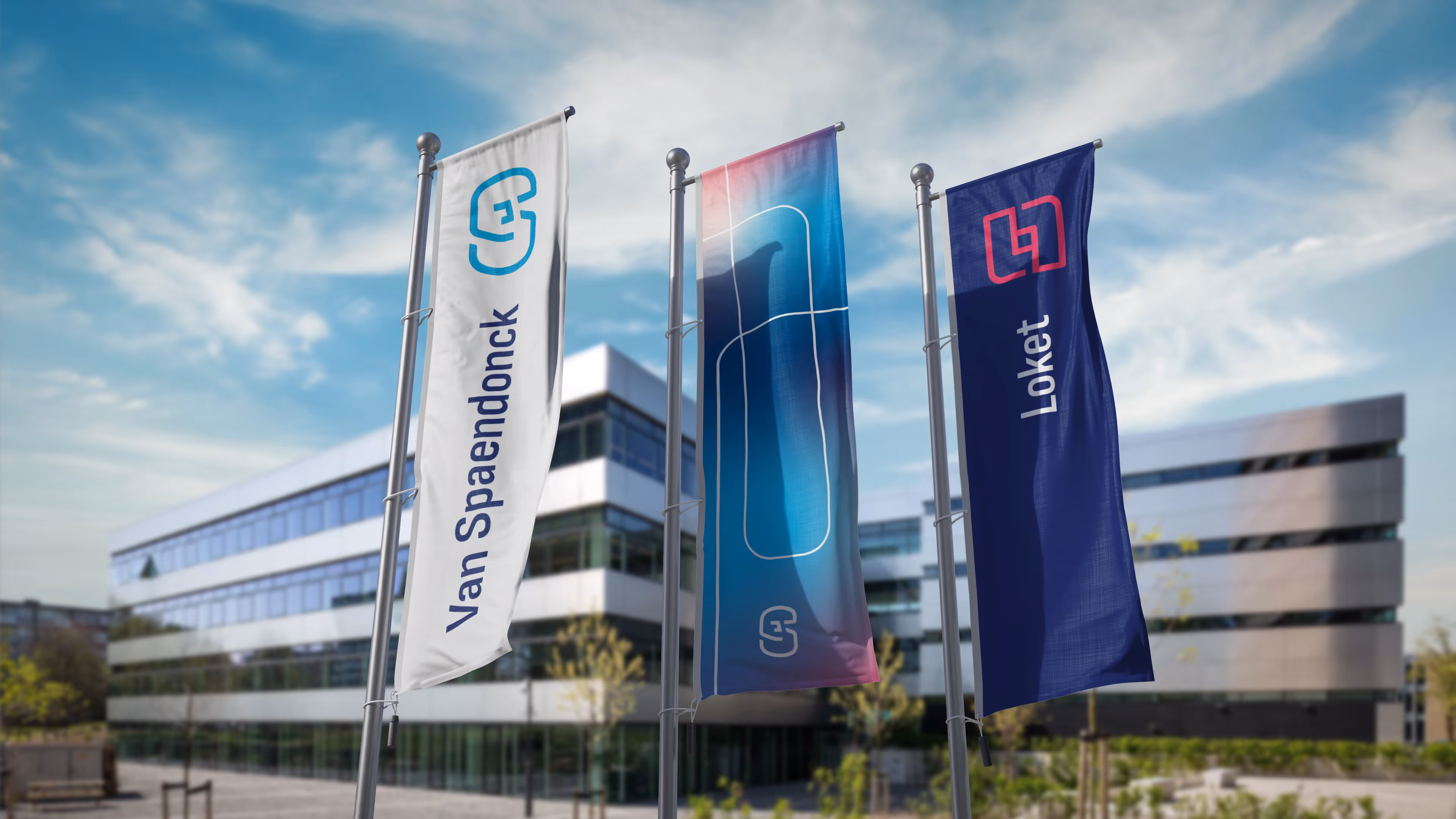
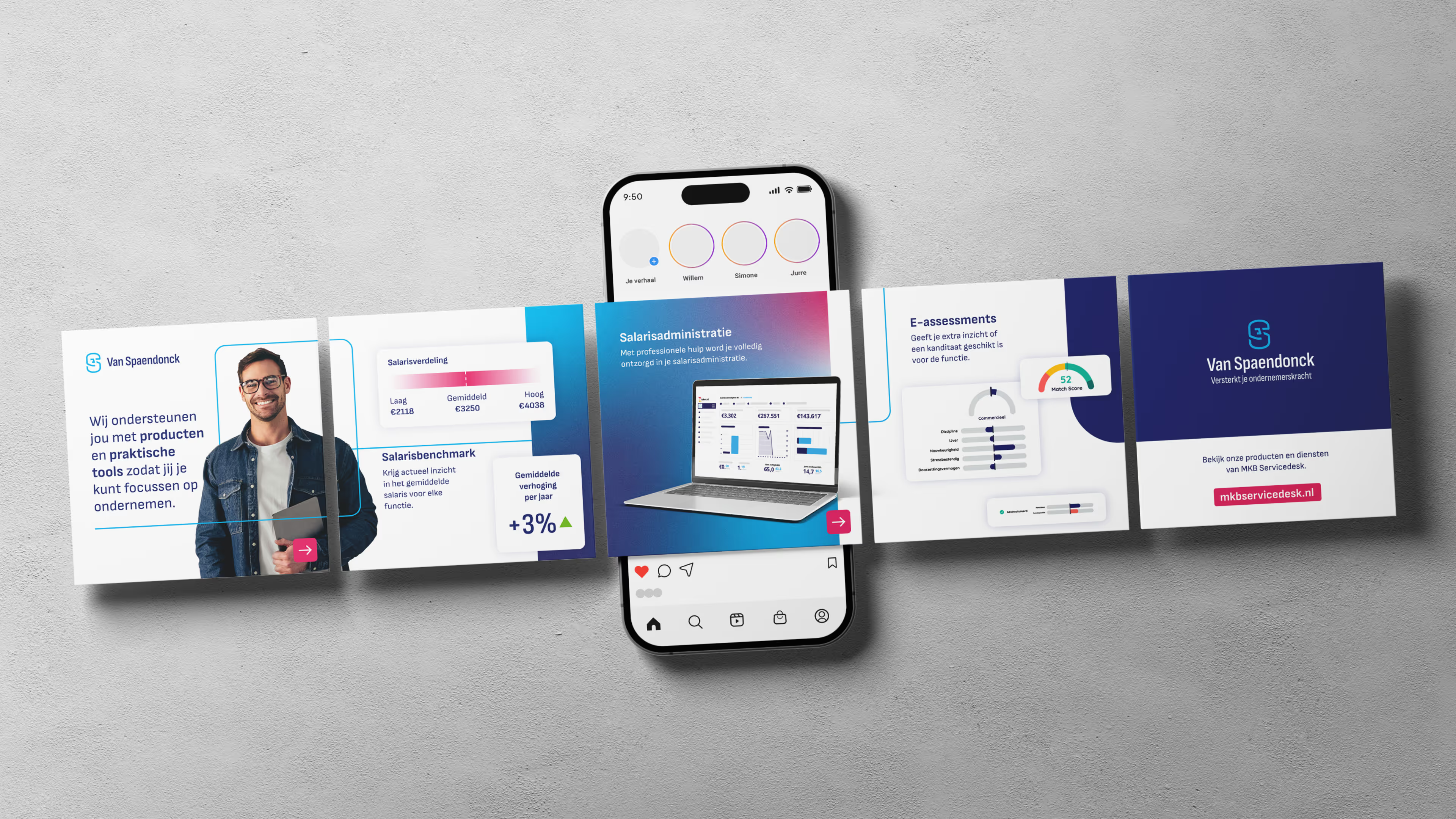
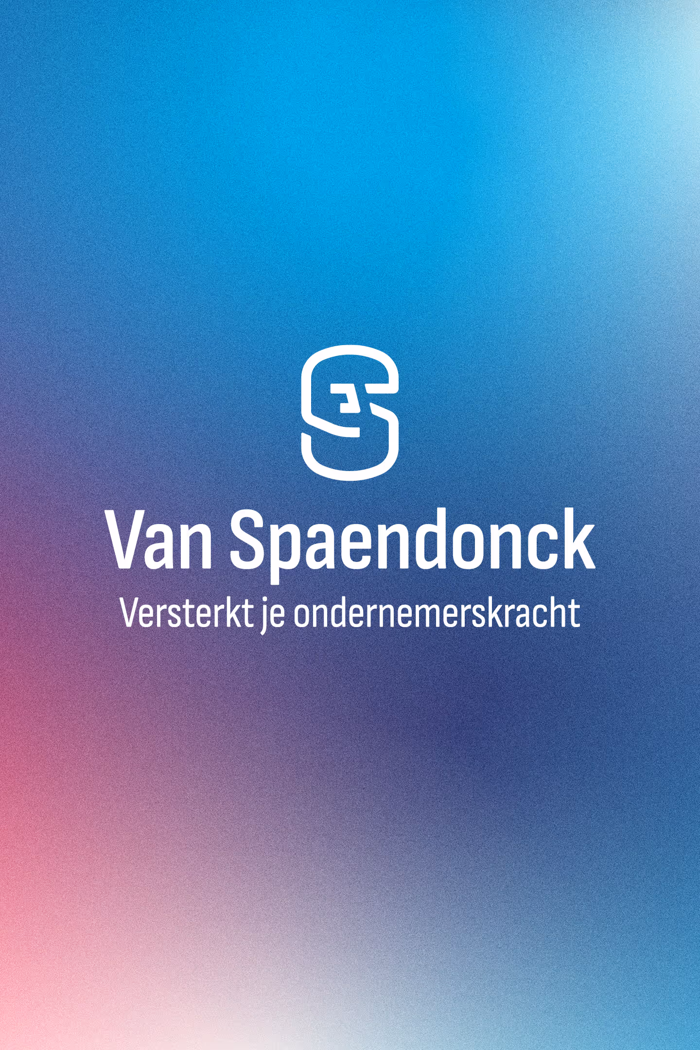
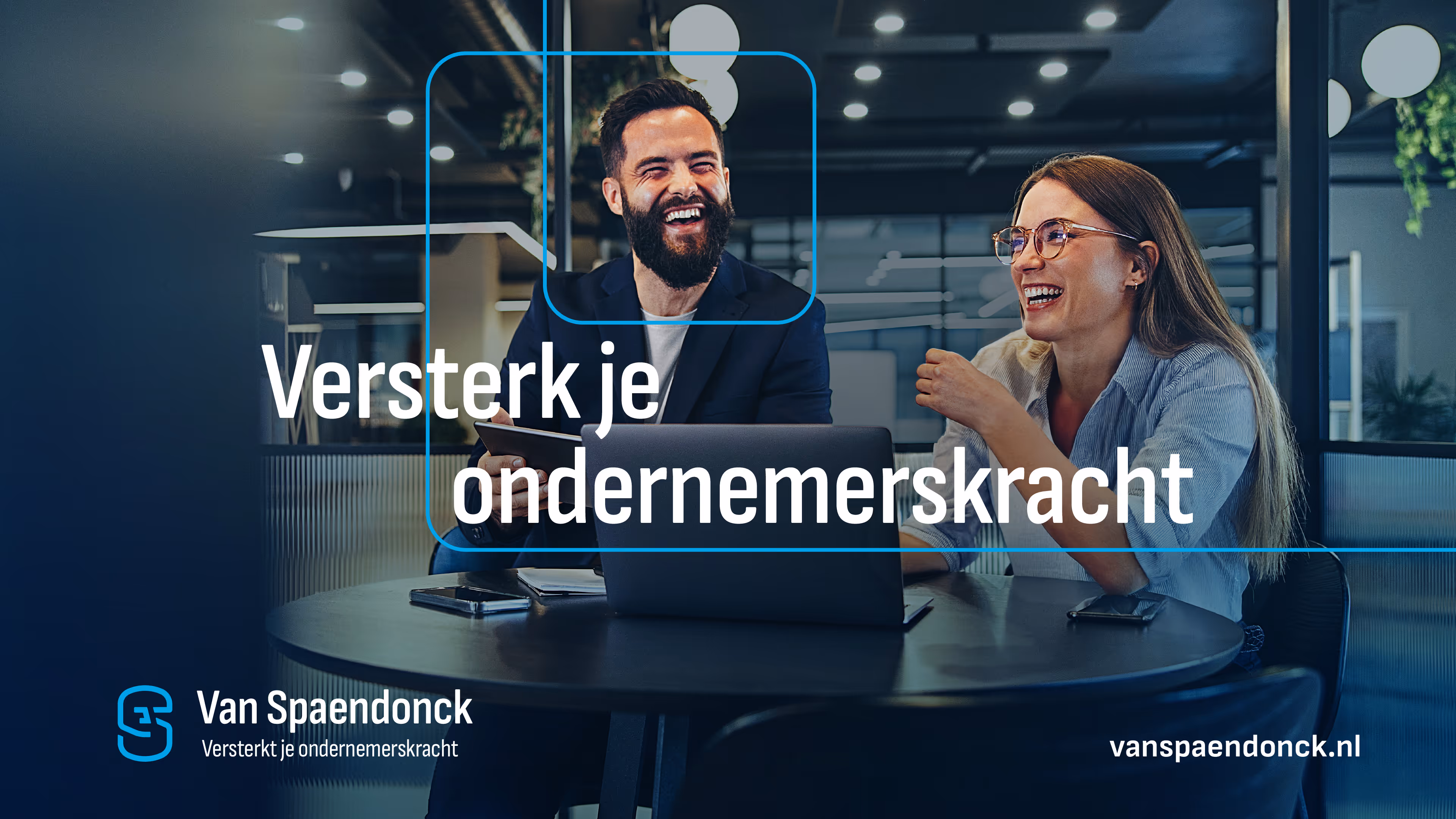
Over the coming years, Van Spaendonck will move forward with a new brand architecture in which labels such as MKB Servicedesk, Loket and Wissenraet are visually linked to the main Van Spaendonck brand. In addition, a refined positioning, a new tagline – “Strengthens your entrepreneurial power” – and a refreshed brand identity have been created.
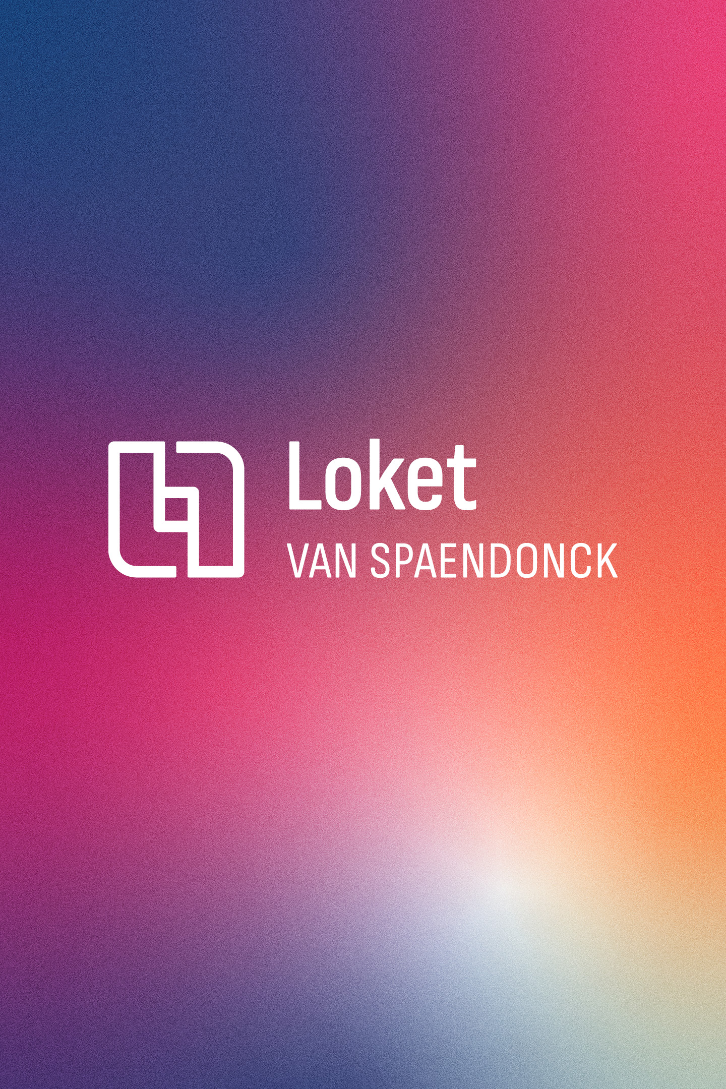
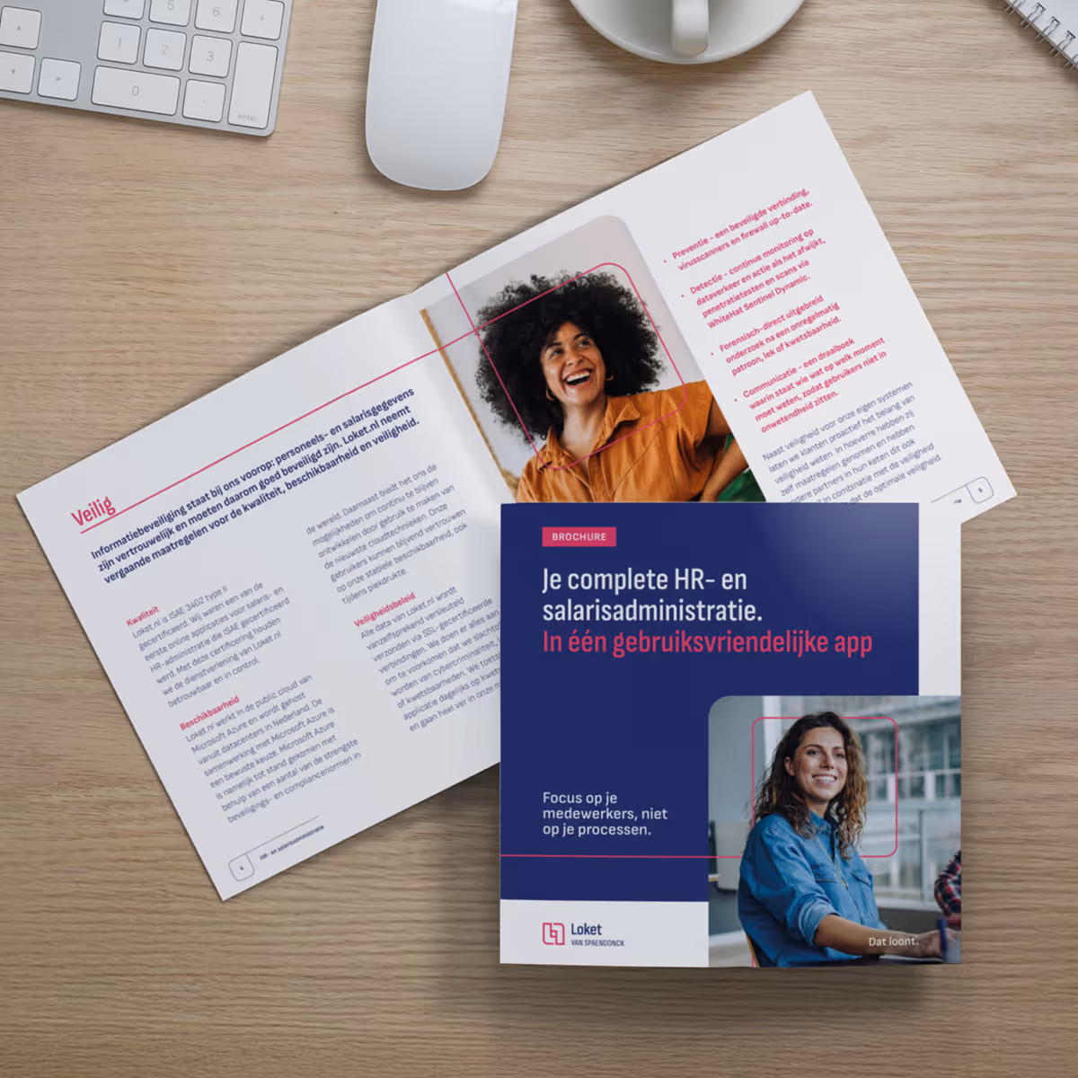
The three labels Loket.nl, Clever and Copilot have been united under a single powerful brand, ‘Loket’, with the new tagline “Loket. It pays off.” A new visual identity has been developed to symbolise the connection with the group, supported by a clear communication concept and an optimised service structure to strengthen the market position as a strategic HR partner.
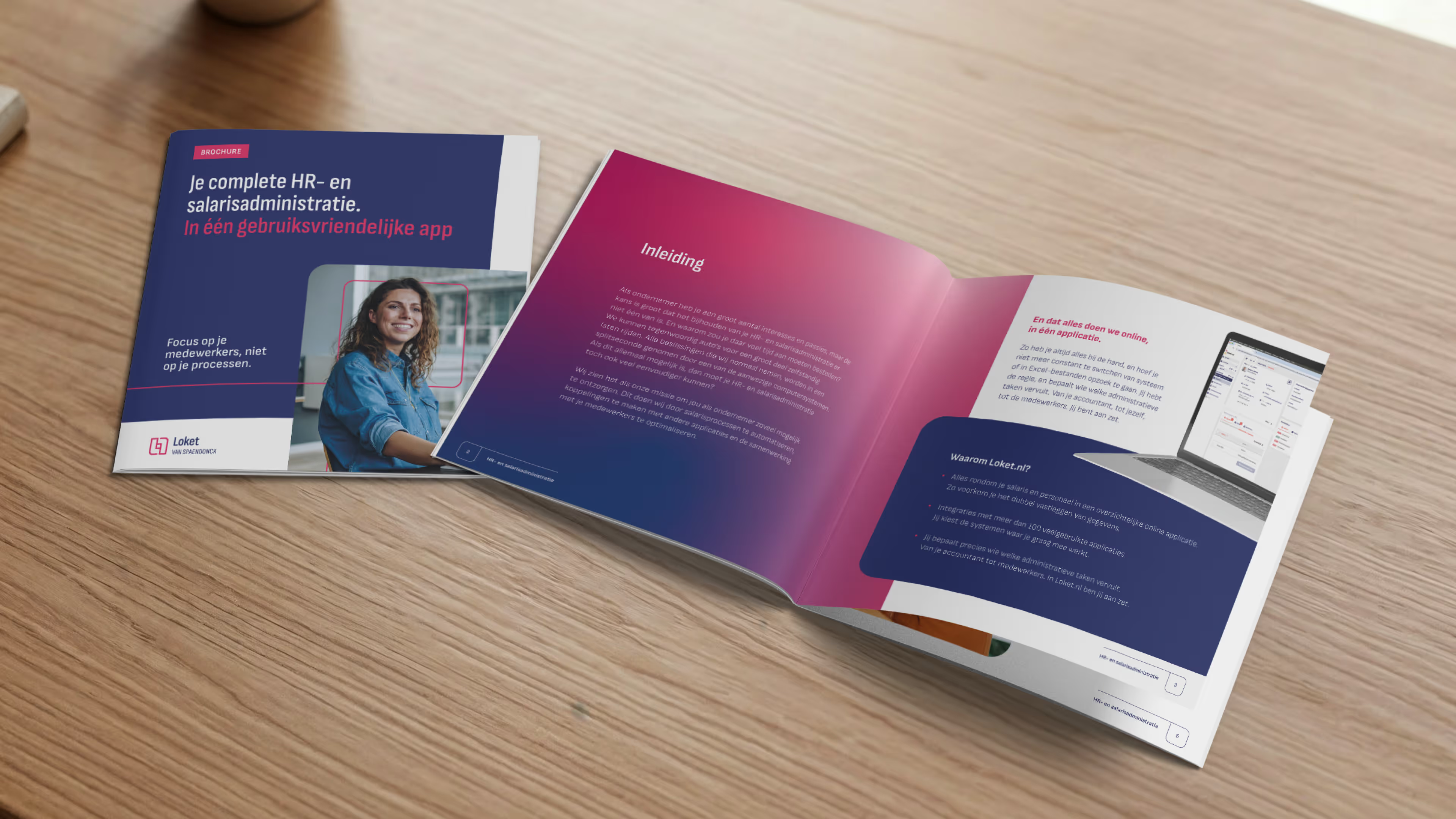
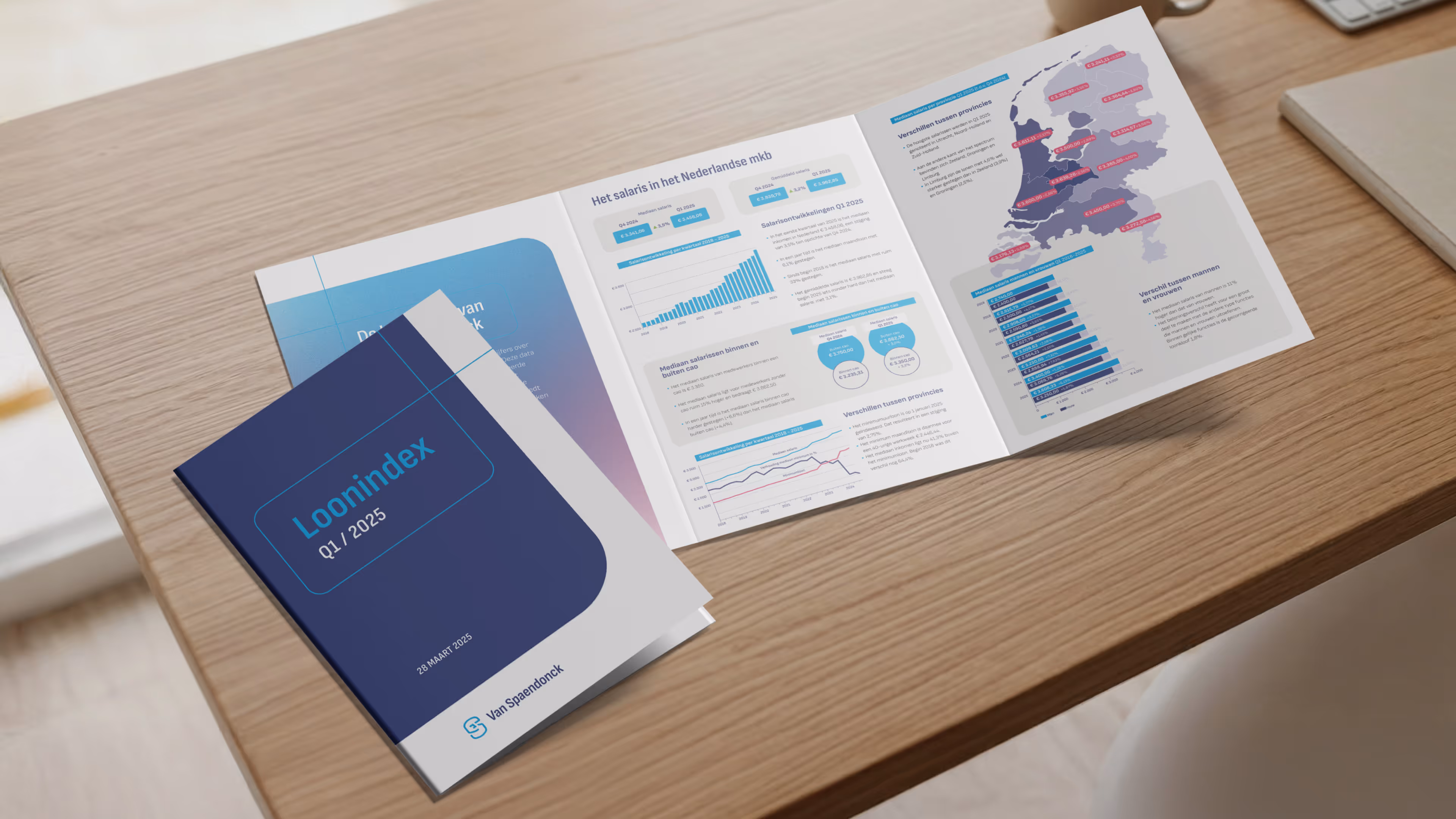
The foundations for the brands have been laid. With this basis and our mock-ups, Van Spaendonck and Loket were able to create the translations themselves.
That is the ZUID effect.
Do you want to prepare your brand for the future and new markets? Let the ZUID effect surprise you.


Beyond the unexpected


